Overview of Graphics II
Graphics 2 is the second level course of graphics at Southwestern High School where you learn to further your ability to use Illustrator, Photoshop, InDesign, and other applications used for graphic design. The projects that are done in graphics two are, the two line design, the commencement or handbook cover, the Saul Bass movie poster, the album cover, the book jacket, the magazine, the Warhol screen print, and the product packaging projects. I took this class because I really enjoyed graphics 1 and I am looking into some careers in either graphic design or engineering so taking this class will help me with the graphic design careers.
Two Line Design
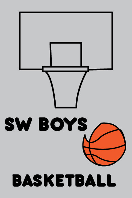
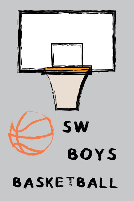
The goal for this project is to develop a graphic using only two continuous lines and incorporate the Gestalt theory of closure in it. I chose to make a basketball hoop and a basketball. The hoop is one line and the ball is another one, I included closure in this project in the net and the basketball. In the picture on the right I could only use two lines, and only have three different colors, in the one on the right I could add strokes and more colors. I really like how the project on the right looks after adding a stroke to it. I don't really like how the basketball looks on the one on the left because of the gap from using 1 line. In total I spent around 6 hours on this project.
|
|
Commencement Cover
|
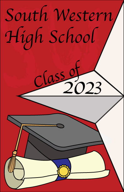
In this project I was supposed to make either a student handbook cover or the commencement cover, I chose to make the graduation commencement cover. In the project there is the school star on the right side, there is also a graduation cap and a diploma because of the people graduating. In the back I incorporated the letters SW to stand for the school and fill some of the empty space. I really like how the cover turned out after changing the fonts and strokes multiple times, I don't really like how cartoon like the graduation cap and diploma look. In total I spent around 4 hours on this project.
|
|
Saul Bass Movie Poster
|
For this project the goal was to recreate a movie poster in the style of Saul Bass, I chose to do Space Jam. In Saul Bass' posters he uses one element from the movie with limited color and detail, he also uses big blocky text. For the poster I chose to make Bugs Bunny in the middle, and use blocky text to fit the movie and poster. I really like Bugs Bunny turned out in the middle, I think it is really easy to tell that it is Bugs Bunny even though it is very simple and there isn't many colors. I don't really like how the text looks after I turned it and changed it a little bit on the bottom. In total I spent around 6 hours on this project.
|

|
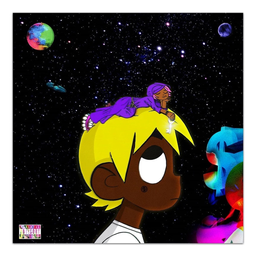
Album Cover
The goal for this project was to recreate an illustrated album cover of your choice. For the cover I chose to recreate Lil Uzi vs The World Deluxe, I chose this album because I really like the album and I really like how the album looks. On the left is the original picture and on the right is my recreation of the cover. The hardest part of this project was the amount of detail on the things in the bottom right. To recreate the colors on the planets and money sign I used the gradient tool to match where the colors go on the gradient. I really like how it turned out, I think using the gradients worked very well to recreate the things in the background. I don't really like how the small spaceship turned out, I also don't really like how I did the stars, they didn't show up very well. In total I spent around 11 hours on this project.
|

|
Book Jacket
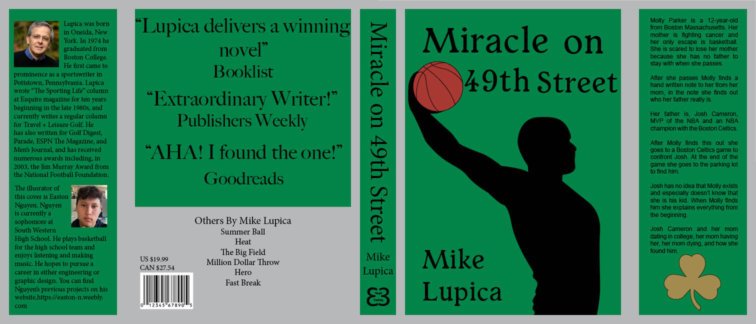
The goal for this project was to pick a book of your choice and create a book cover for it using InDesign, Photoshop, or Illustrator. I chose to create a cover for the book "Miracle on 49th Street" by Mike Lupica. In the book one of the main characters plays basketball for the Boston Celtics so I decided to use green as the background to incorporate something from the book. I also used the Celtics clover logo to fill some empty space in the front inside flap of the jacket. On the front cover I used Illustrator to create the silhouette of someone dunking a ball and also to create the text used on the cover. For the rest of the jacket I used InDesign to make the layout, make the different colors and add the different bodies of text. My favorite part of the project is the back cover I think it turned out really good with making only half of it green and the rest gray, my least favorite part is the front cover, I think the persons arm looks a little weird and I think it could look better. In total I spent around 12 hours on this project.
Magazine Cover, Table of Contents and Article
|
The goal for this project was to create a magazine cover, a table of contents, and an article of your choice. I chose to make my magazine about Kobe Bryant and name it Mamba Magazine. For the cover I took a picture of a Kobe sports card and use it as the main photo. I used a different picture of him and cut out his leg to make it go over the edge of the card and go over the text. For the table of contents I chose to make the background a light gray, I also used the Lakers colors for the columns of text. I chose to use two different pictures of him at the top of the page and have to columns overlap them. For the article I chose to use the same light gray for the background as I did in the table of contents. I also chose to have a picture of Kobe dunking go off the side of the page and have the text wrap around the photo. I really like how the table of contents came out, I spent a lot of time moving stuff around and changing colors on it. I don't really like how the ball looks at the bottom of the page of the article. In total I spent around 45 hours on this project.

|


|
Warhol Screen Print
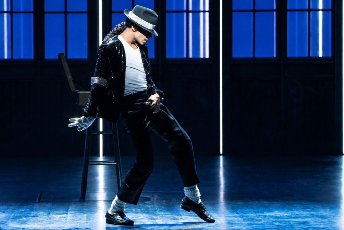
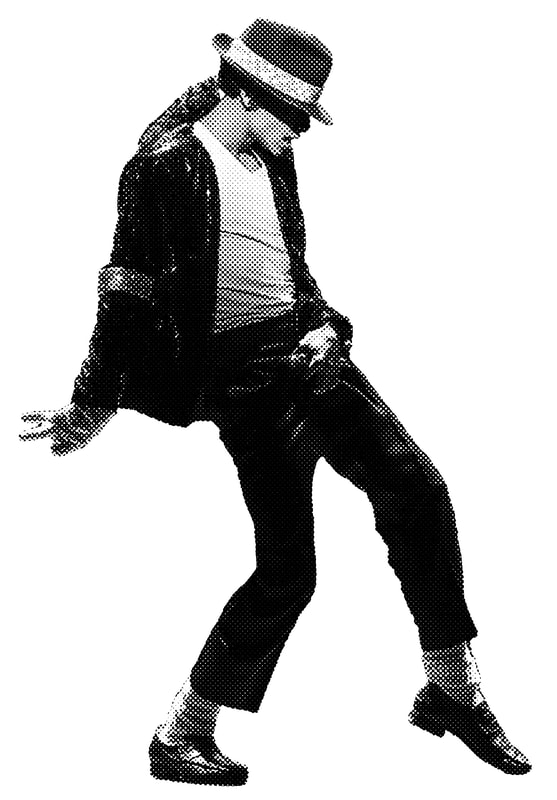
The goal for this project was to choose a famous person and create a halftone of a screen print of them. For this process you first choose an image of the person and make it into a half tone on Illustrator, then you print it out and burn it onto the screen. After you have the screen made you make another screen with parts that you want to fill in with a different color. After you have the screens made you print the halftone onto a paper with black ink then you print the blocks of color over top with a different color. For this project me and my partner chose to do Michael Jackson. We chose to make the blocks of color in pink ink and we printed on many different papers including blue, green, yellow, gray, and orange. I really like how the prints on the blue paper turned out. I don't really like how the half tone turned out because it didn't all come out when we burnt the screens. In total we spent about 4 and a half hours on this project.

|
|
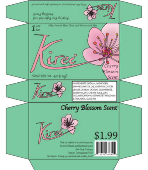
Product Packaging
The goal for this project was to create a box for a bar of soap. For the soap brand I chose to make it Kirei which means wash in Japanese, because I made the name Japanese I made the box with a Japanese style. I made the background a light teal color and made pink accents. My original design was going to have cherry blossom flowers all around the box, but I decided to just make one big one on the side of it. In total I spent around 3 hours on this project. I really like how the logo and the flower turned out. If I were to do it again I wouldn't change anything.
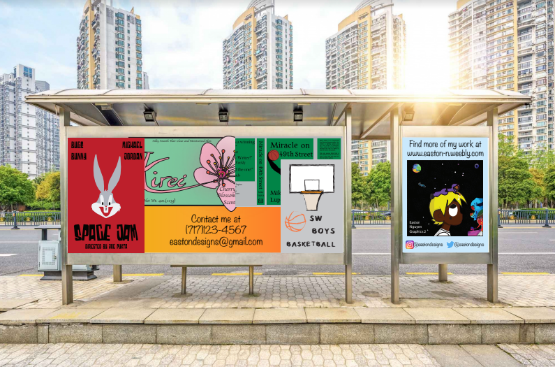
Bus Stop
The goal for this project was to make a bus stop as an advertisement to show off your work. I decided to make the work overlapping because that's how I see a bus stop in my head. I really like how the right side looks with the social media and the website. In total I spent around 1 hour on this project. If I were to change one thing on this project I would probably not make the projects overlap, and I would put less projects on the bus stop.
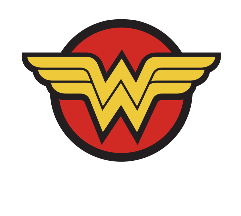
Tutorial
The goal for this project was to pick a tutorial to complete. I chose to do the Wonder Woman logo tutorial to complete. This tutorial took me around 25 minutes to complete. I really like how it turned out, but the glow on the ‘W’ didn’t show work like it said on the tutorial.